THE BRAND / A MARCA
EN
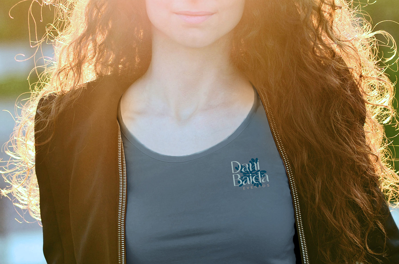
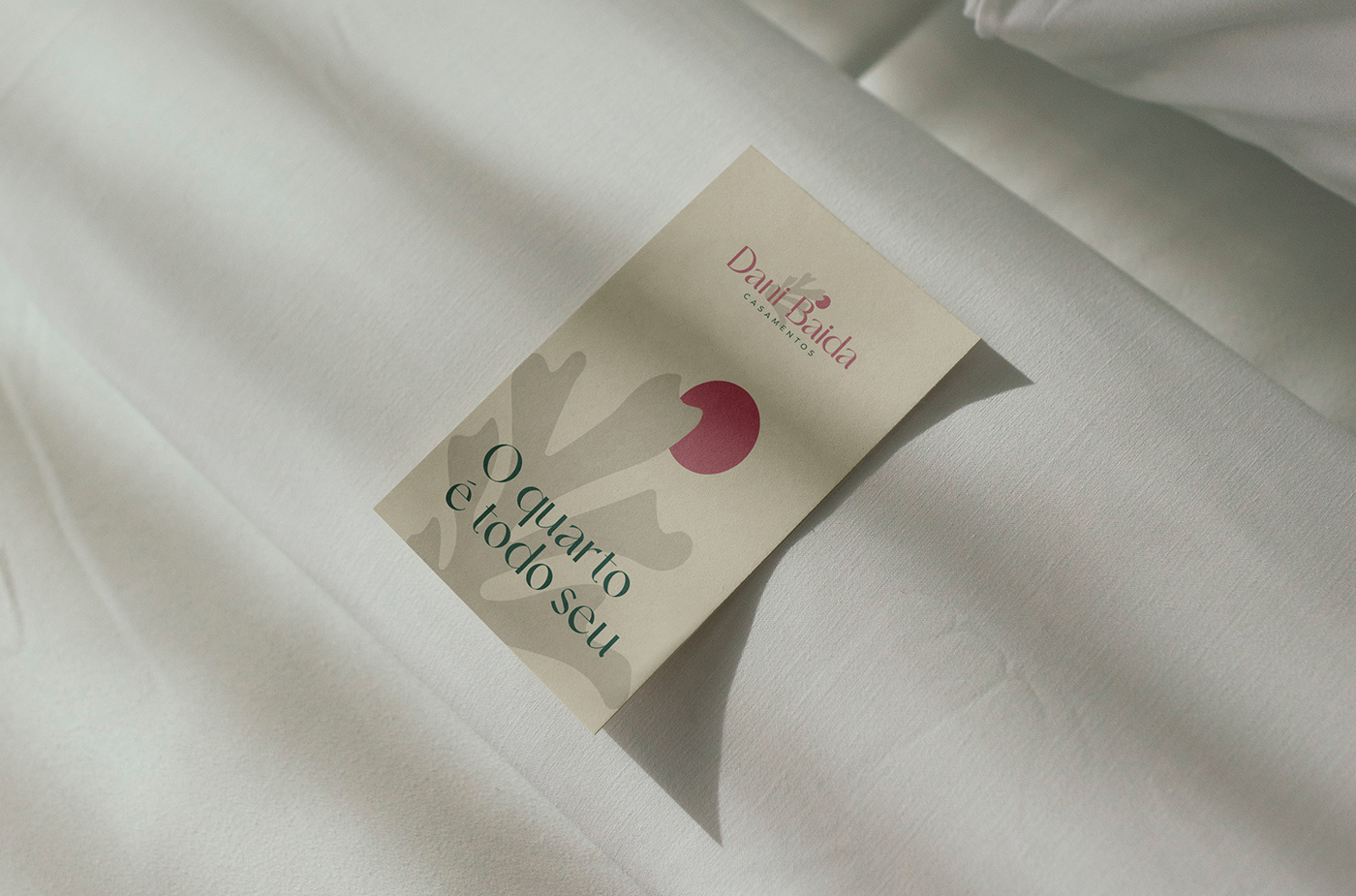
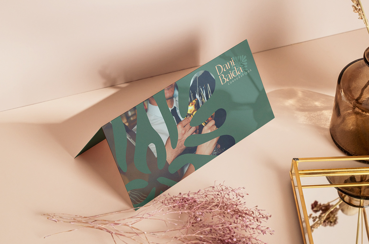
Dani Baida
Brand Arqchitecture, Visual Identity, Social Media and Website
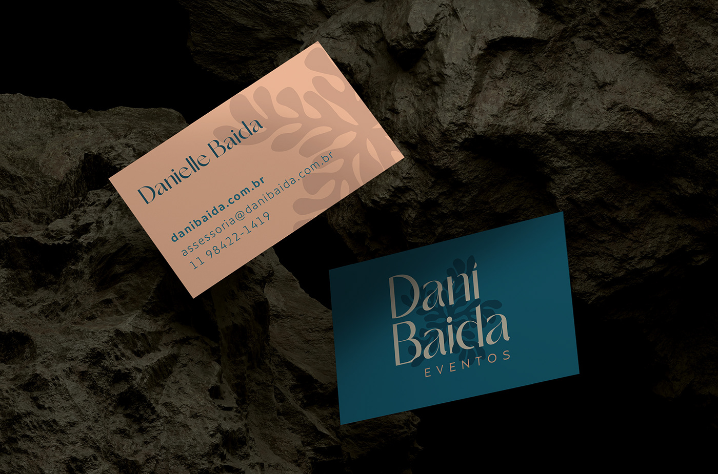
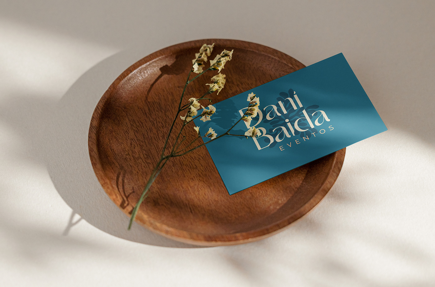
Dani Baida is a company that provides advisory and consultancy services for social and corporate events, offering full practical and logistical support, as well as mediating with suppliers and partners in the execution of events. It was born with the purpose of making dreams come true and making the host's life easier and more peaceful, with great care, respect, and affection. After all, organizing an event is about caring.
Dani Baida is a company that provides advisory and consultancy services for social and corporate events, offering full practical and logistical support, as well as mediating with suppliers and partners in the execution of events. It was born with the purpose of making dreams come true and making the host's life easier and more peaceful, with great care, respect, and affection. After all, organizing an event is about caring.
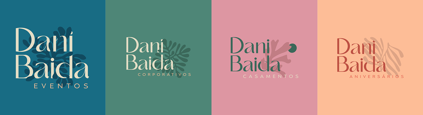
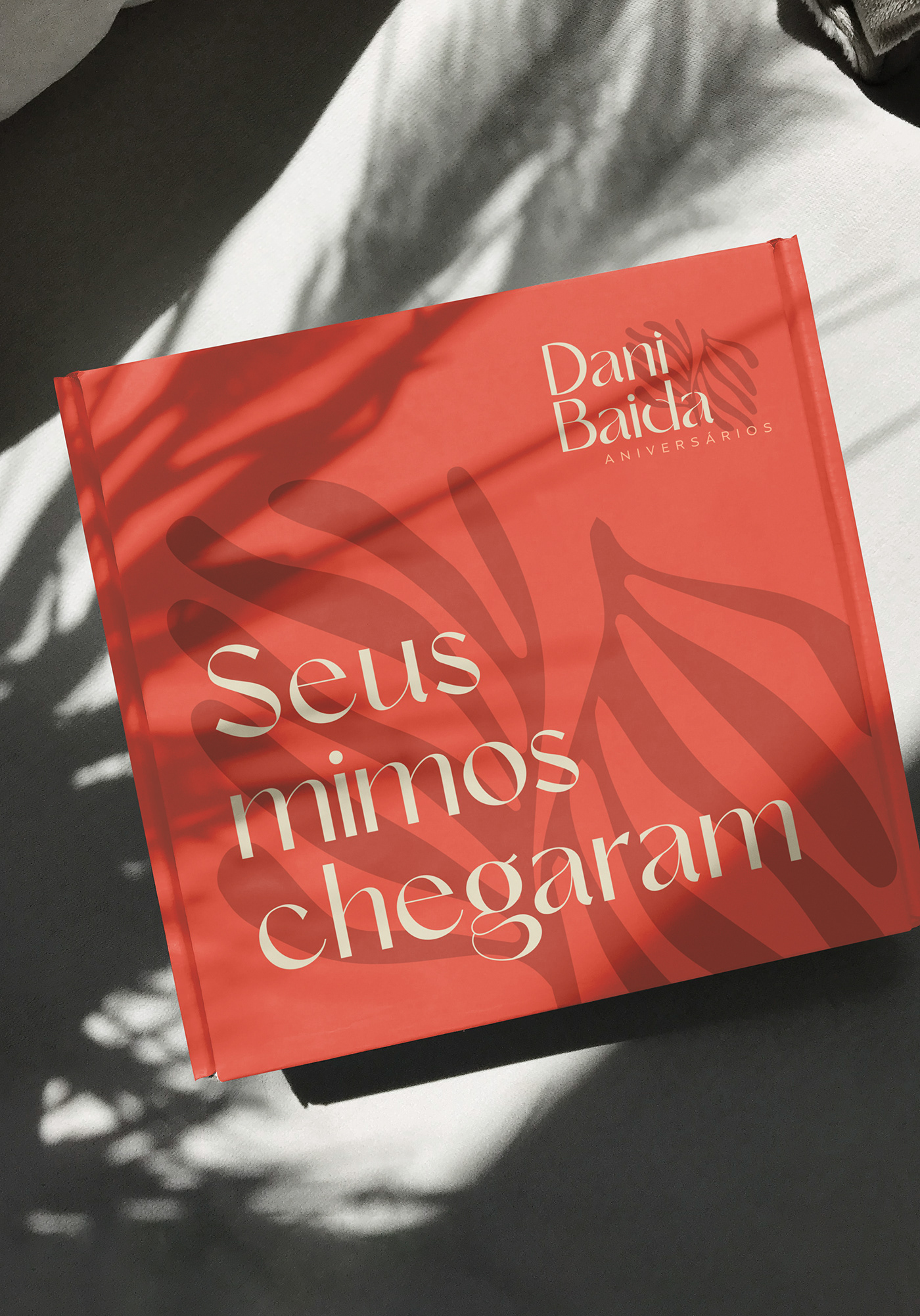
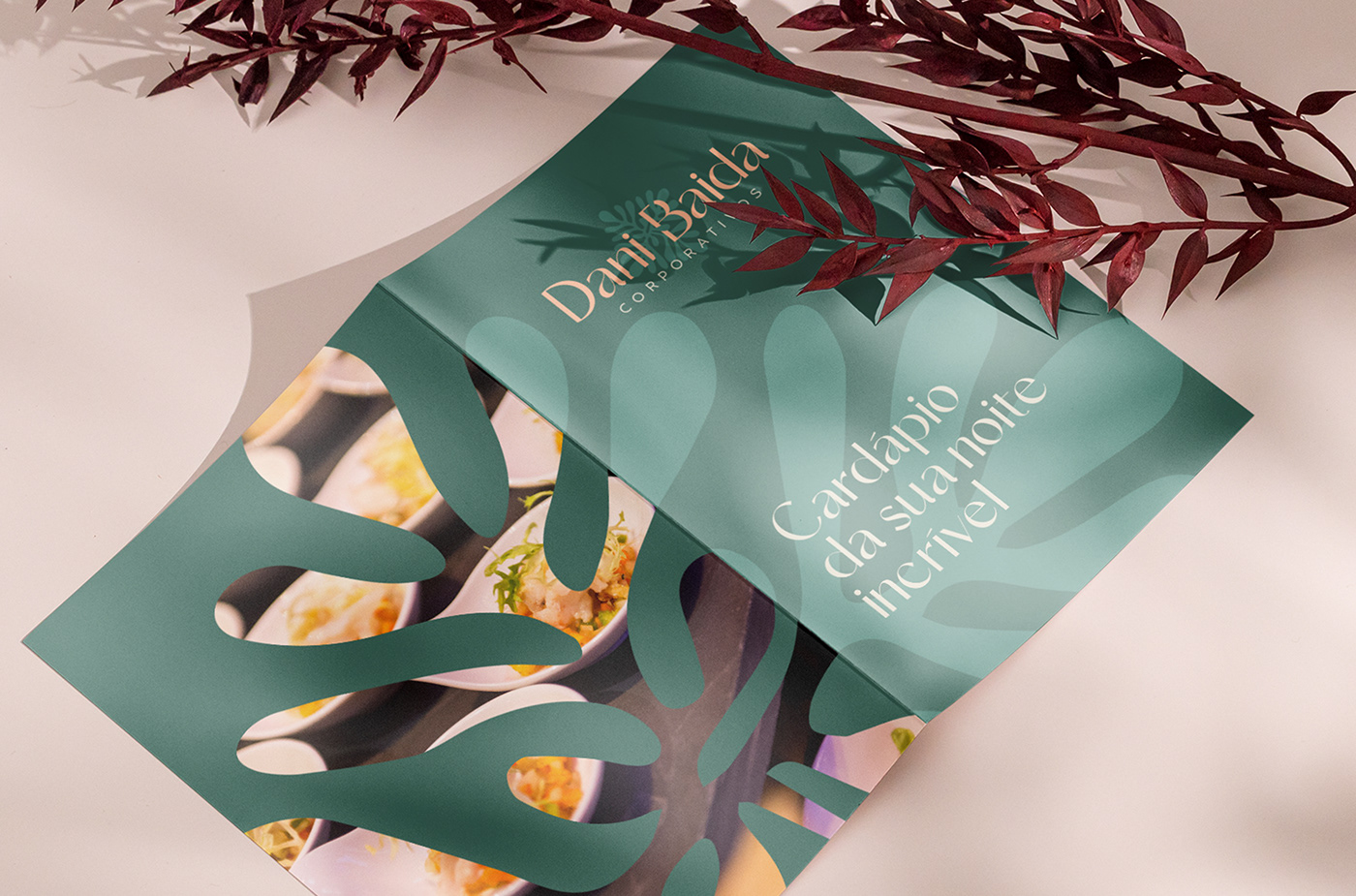
Some brands may extend into variations of visual identity, whether in the logo, shapes, graphics, colors, or typography. This happens depending on the type of business or variations in products and services. Based on these criteria, an architecture for this brand was suggested.
PT
Dani Baida
Arquitetura de Marca, Identidade Visual, Mídias Sociais e Site
Dani Baida é uma empresa que presta assessoria e consultoria para eventos sociais e corporativos, dando todo o suporte prático e logístico, fazendo também a mediação com fornecedores e parceiros na realização dos eventos. Ela nasceu com o propósito de realizar sonhos e tornar a vida do anfitrião mais fácil e tranquila, com muito cuidado, respeito e carinho. Afinal, organizar um evento é cuidar.
Algumas marcas podem se estender em variações de identidade visual, seja no logotipo, formas, grafismos, cores ou tipografia. Isso ocorre a depender do tipo de negócio ou variações de produtos e serviços. Por esses critérios, foi sugerida uma arquitetura para essa marca.

CONCEPT / CONCEITO
EN
After researching and studying the events market, it becomes clear what people want when hiring consultancy services: care. Like a mother cares for her daughter. Like a leader cares for their team. Taking care of the hosts, taking care of the suppliers, and taking care of the details: that is the key message to be conveyed.
After researching and studying the events market, it becomes clear what people want when hiring consultancy services: care. Like a mother cares for her daughter. Like a leader cares for their team. Taking care of the hosts, taking care of the suppliers, and taking care of the details: that is the key message to be conveyed.
PT
Após pesquisar e estudar o mercado de eventos, fica claro o que as pessoas querem ao contratarem uma assessoria: cuidado/zelo. Como uma mãe cuida da sua filha. Como um líder cuida da sua equipe. Cuidar dos anfitriões, cuidar dos fornecedores e cuidar dos detalhes: essa é a grande mensagem a ser transmitida.


INSPIRATION & SYMBOLS / INSPIRAÇÃO E SÍMBOLOS
EN
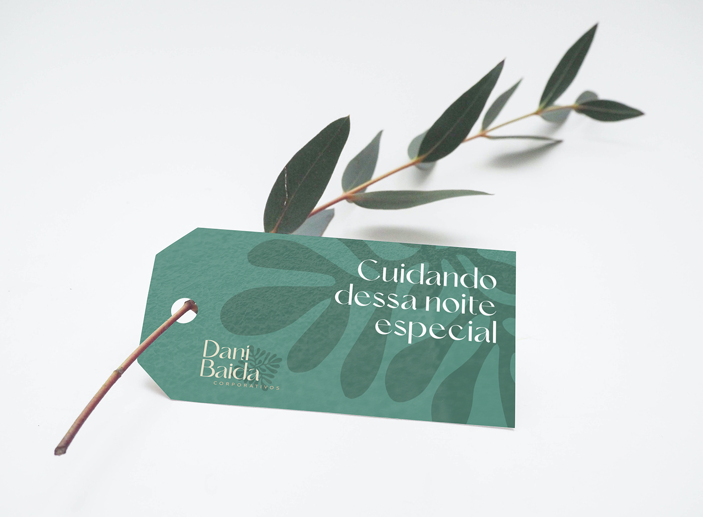
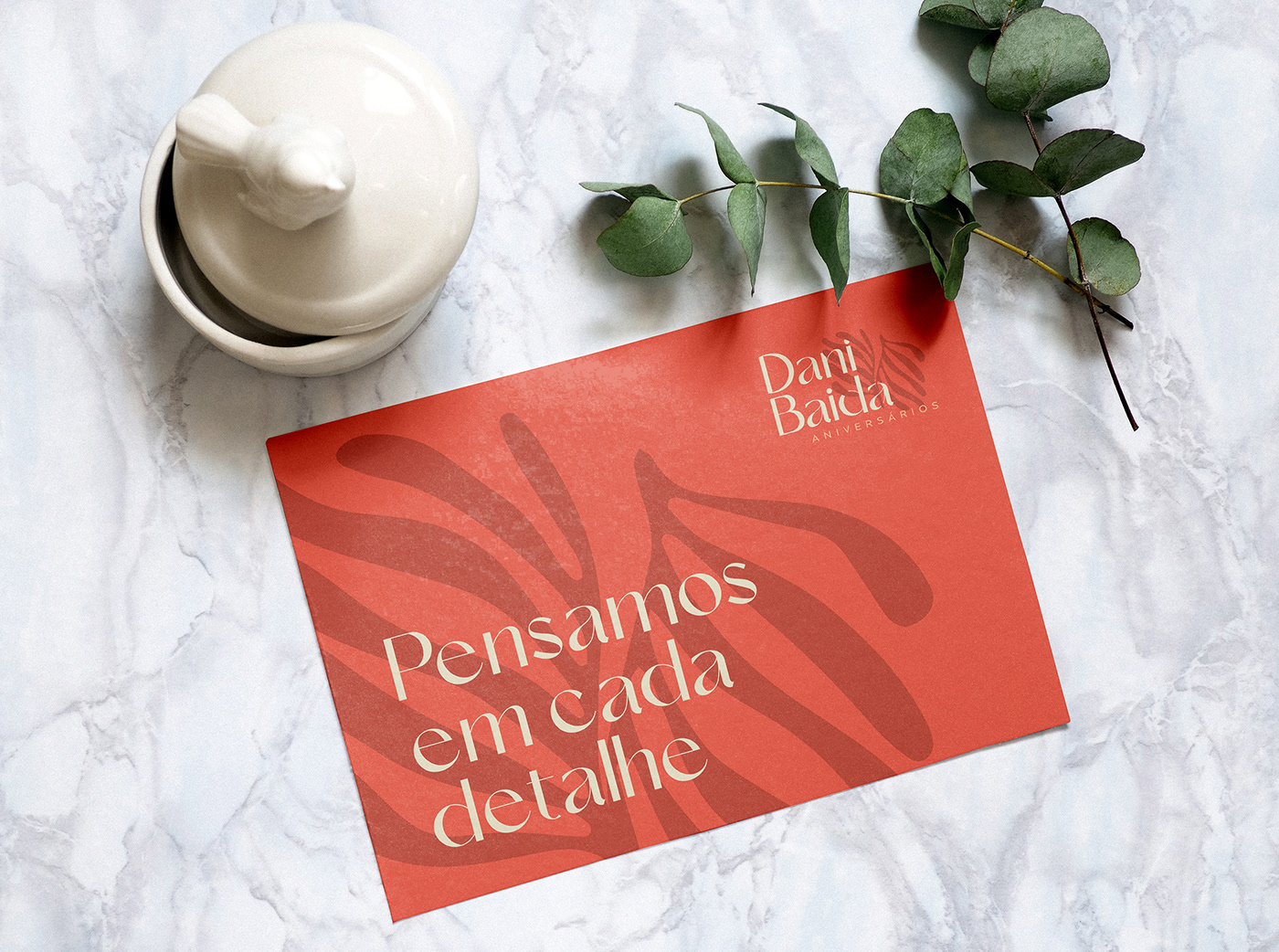
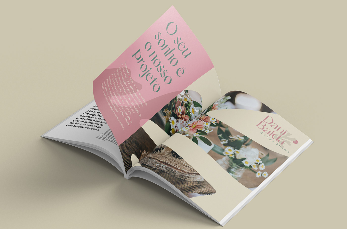
The starting point of inspiration is always the brand's truth. In the case of Dani Baida: "Organizing an event is caring." Thinking about every detail in each project is the fundamental role of an event consultancy. So why not bring those details into the brand?
It was then that the figure of Henri Matisse (1869-1954) emerged, a French artist known for his use of color and his fluid and original drawing style. Matisse saw the forms of nature as a means to explore color, light, and shadow, not just as an objective representation of reality. He often simplified and exaggerated natural forms in his works to create a sense of harmony and balance. Matisse's color palette is recognized for its vibrancy and luminosity.
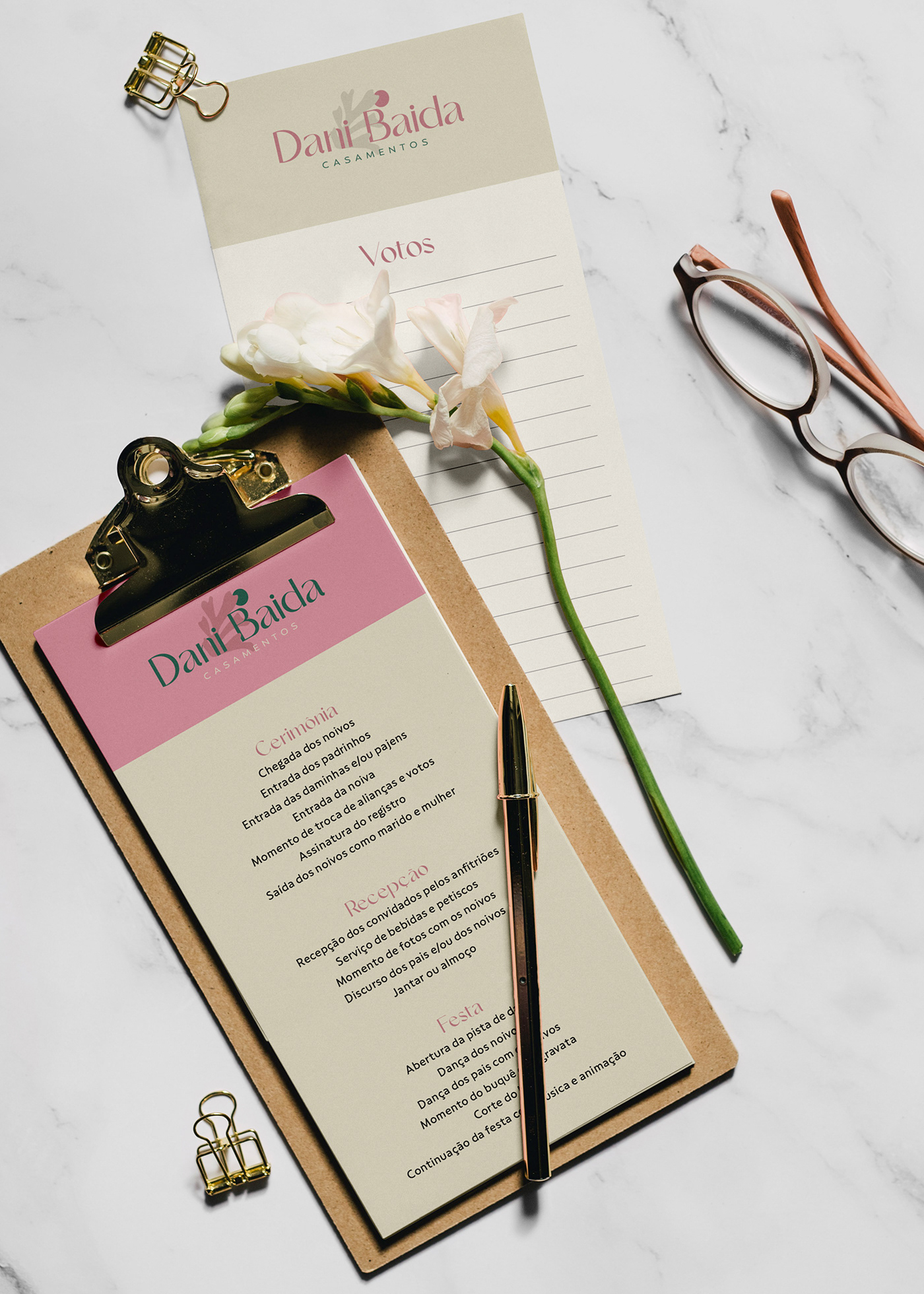
Taking care of an event means taking care of the smallest details. Specimens of plants, florals, and spices are some of these details that are always present in events, whether in a table arrangement or in the decoration of a dish.
Henri Matisse knew better than anyone how to abstract these images into simple, organic, vibrant, and unique forms. It is this same attention to detail that we want to convey with the brand. Following this reasoning, and inspired by Matisse's works, these four forms of plant specimens were abstracted.
PT
O ponto de partida de inspiração é sempre a verdade da marca. No caso da Dani Baida: “Organizar um evento é cuidar”. Pensar em cada detalhe em cada projeto é o papel fundamental de uma assessoria de eventos. Então, porque não trazer esses detalhes para a marca?
Foi então que surgiu a figura de Henri Matisse (1869-1954), um artista francês conhecido por seu uso da cor e sua arte de desenhar, fluida e original. Matisse via as formas da natureza como um meio para explorar a cor, a luz e a sombra, e não apenas como uma representação objetiva da realidade. Ele frequentemente simplificava e exagerava as formas naturais em suas obras, a fim de criar uma sensação de harmonia e equilíbrio. A paleta de cores de Matisse é reconhecida por sua vivacidade e luminosidade.
Cuidar de um evento é cuidar dos mínimos detalhes. Espécimes de plantas, florais e temperos são alguns desses detalhes que estão sempre presentes nos eventos, seja em um arranjo de mesa ou na decoração de um prato.
Henri Matisse sabia como ninguém como abstrair essa imagens em formas simples, orgânicas, vibrantes e únicas. É esse mesmo cuidado com os detalhes que queremos transmitir com a marca. Seguindo este raciocínio, e inspirado nas obras de Matisse, foram abstraídas essas quatro formas de espécimes de plantas.


COLORS / CORES
EN
As seen in the brand strategy, there was a spectrum of colors that had not yet been explored by the market. Thus, the base of the primary colors was extracted.
The primary colors are vibrant but not overly saturated, bringing the tone of sophistication, maturity, and seriousness that the brand needed. However, they also bring a touch of fun and youthfulness. As for the secondary colors, they are slightly darkened to allow for combinations with interesting contrasts – such as day and night.
PT
Conforme visto na estratégia da marca, havia um espectro de cores que ainda não havia sido explorado pelo mercado. Assim foi extraída a base das cores primárias.
As cores primárias são vibrantes, mas não tão saturadas, trazem o tom de sofisticação, maturidade e seriedade que a marca precisava. Mas trazem, também, um toque de diversão e jovialidade. Já nas cores secundárias, elas ficam levemente escurecidas para que seja possível fazer combinações com contrastes interessantes – como o dia e a noite.


TYPOGRAPHY / TIPOGRAFIA
EN
To differentiate itself from competitors and stand out in the events market, it was necessary to steer clear of some clichés. Handwritten letters, uppercase, and thin lines are the industry standard. Therefore, the typographic choice was the Le Amatcky font from the Hishand Studio foundry: refined, beautiful, contemporary, and slightly bold. Details such as the bowl of the lowercase 'a' and the tail of the 'g' bring a lot of personality to the font.
The supporting typography is part of the graphic universe defined to convey the perceptions and communication objectives outlined for the brand. Considering that the primary typography has a lot of personality and strength, the supporting typography needed to be neutral and easily legible. Therefore, the chosen family was Compasso, from Plau.
PT
Para se diferenciar dos competidores e se destacar no mercado de eventos, era preciso fugir de alguns clichês. Letras manuscritas, caixa alta e linhas finas é o padrão do mercado. Por isso, a escolha tipográfica foi pela fonte Le Amatcky, da foundry Hishand Studio: refinada, bela, contemporânea e levemente ousada. Detalhes como o bojo do A minúsculo e a cauda do G trazer muita personalidade para a fonte.
A tipografia de apoio faz parte do universo gráfico definido para transmitir as percepções e objetivos de comunicação traçados para a marca. Considerando que a tipografia primária tem bastante personalidade e força, a tipografia de apoio precisava ser neutra e de fácil legibilidade. Por isso, a família escolhida foi a Compasso, da Plau.


PHOTOGRAPHY / FOTOGRAFIA
EN
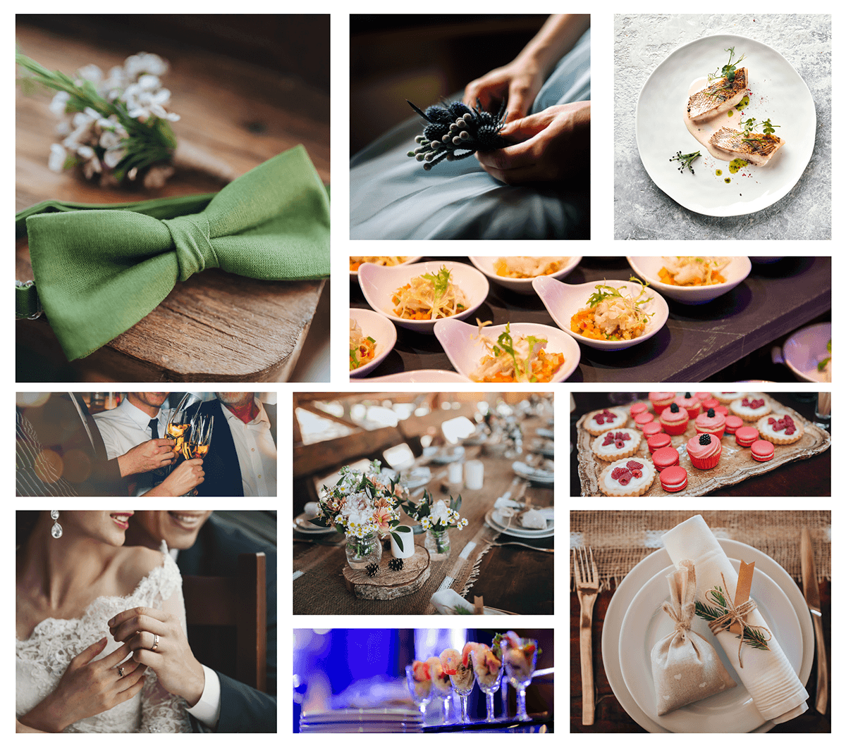
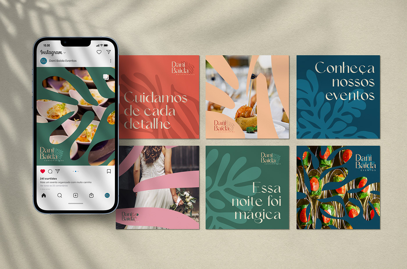
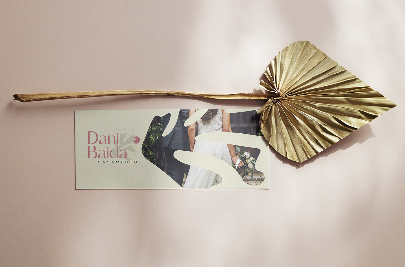
Following the concept that we take care of every detail of the events, the photographic language should reflect this idea, focusing on these details and preferably using macrophotography and close-up shots. Props, ornaments, fabrics, elements, spices... anything meticulous can be highlighted in the communication.
On the other hand, wide and open photos can distort the meaning and not convey the same idea. By highlighting, for example, the event space, there's a risk of favoring the image of the catering over the consultancy. The focus here is on the service offered and the attention to detail.
PT
Seguindo o conceito de que cuidamos de cada detalhe dos eventos, a linguagem fotográfica deve seguir essa ideia, dando enfoque a esses detalhes e, preferencialmente utilizando-se da macrofotografia e aproximação de câmera. Adereços, adornos, tecidos, elementos, temperos... tudo o que for minucioso pode ser destacado na comunicação.
Por outro lado, fotos amplas e mais abertas podem distorcer o sentido e não transmitirem a mesma ideia. Ao evidenciar, por exemplo, o espaço do evento, corre-se o risco de favorecer muito mais a imagem do buffet do que da assessoria. O foco aqui é o serviço oferecido e o cuidado com os detalhes.
Por outro lado, fotos amplas e mais abertas podem distorcer o sentido e não transmitirem a mesma ideia. Ao evidenciar, por exemplo, o espaço do evento, corre-se o risco de favorecer muito mais a imagem do buffet do que da assessoria. O foco aqui é o serviço oferecido e o cuidado com os detalhes.